Litespace / Website Redesign

Modernizing Litespace's digital experience.

Helping an AI-powered HR technology company improve its website experience through clearer navigation, thoughtful UI design, and scalable web development.

Role
Product Designer
Project Type
Website Redesign & Development
Contribution
UX/UI Design · Design Systems · Webflow

The project

Redesigning Litespace's website for a growing HR technology company.

Litespace is an AI-powered HR technology company focused on helping organizations streamline workplace and people-management processes.

As a Product Designer, I worked on improving and expanding the company's public-facing website. The existing experience needed a more modern visual direction, clearer navigation, and better ways for visitors to discover relevant content.

My work spanned redesigning existing pages, creating new experiences, contributing to a reusable design system, and implementing designs directly in Webflow.

From pricing and webinars to blogs and HR resources, the goal was to create a more consistent, engaging website that could evolve alongside the business.

A website ready for change.

A growing platform with a website that needed to catch up.

As Litespace evolved, its website wasn't keeping pace with the company's needs. The existing interface felt outdated, and inconsistent layouts and design patterns made it harder to deliver a cohesive experience across pages.

The business also wanted to attract more visitors and encourage them to explore its content, particularly its growing library of HR resources and blog articles. Improving discoverability, usability, and engagement became important priorities.

Beyond refreshing the visuals, the challenge was to create a website that could accommodate new content and experiences without sacrificing consistency or becoming increasingly difficult to maintain.

01

An outdated and inconsistent interface

The website had older layouts and visual patterns that no longer reflected Litespace's evolving brand. Updating individual pages without a shared design foundation also made it difficult to maintain consistency across the experience.

02

Content that was difficult to discover

As the library of blog articles and HR resources grew, visitors needed clearer ways to browse, filter, and navigate content. Improving discoverability was important to encourage deeper exploration of the website.

03

Supporting growth without adding complexity

New pages and content experiences needed to be designed and launched efficiently. Without reusable components and structured CMS templates, maintaining a cohesive website would become increasingly challenging as Litespace expanded.

From concept to launch.

Taking ideas from early explorations to live experiences.

My work followed an iterative design process, moving from understanding requirements and exploring early layouts to refining high-fidelity designs through feedback. Beyond the design stage, I also implemented approved pages directly in Webflow, connecting CMS-driven content where needed.

01

Understanding the requirements

I started by identifying the purpose of each page, the content it needed to communicate, and how visitors should navigate through it. This helped establish a direction before moving into design.

02

Exploring layouts and user flows

I used low- and mid-fidelity wireframes to explore page structures, content hierarchy, navigation, and interactions before committing to a visual direction.

03

Refining through feedback

I developed high-fidelity designs in Figma, incorporating Litespace's visual identity and reusable components. Feedback helped me iterate on the layouts and interactions before implementation.

04

Building and launching in Webflow

I designed screens, interactions, and error states, and used regular BA touchpoints to clarify requirements, close gaps, and iterate.

Selected Work

Designing across the Litespace website.

My work extended across multiple areas of Litespace's website, from product-focused experiences to educational resources and content-driven pages.

Each page presented different challenges, whether it was organizing pricing information, helping visitors discover HR resources, or creating clear registration experiences for upcoming webinars.

The examples below highlight a selection of the pages I designed and implemented, bringing together consistent visual patterns, clearer content hierarchy, and reusable layouts across the website.
Turning designs into live experiences.

Designing and launching new website experiences.

Beyond refreshing existing pages, I designed and implemented new experiences that expanded Litespace's website and made its content more accessible to visitors.

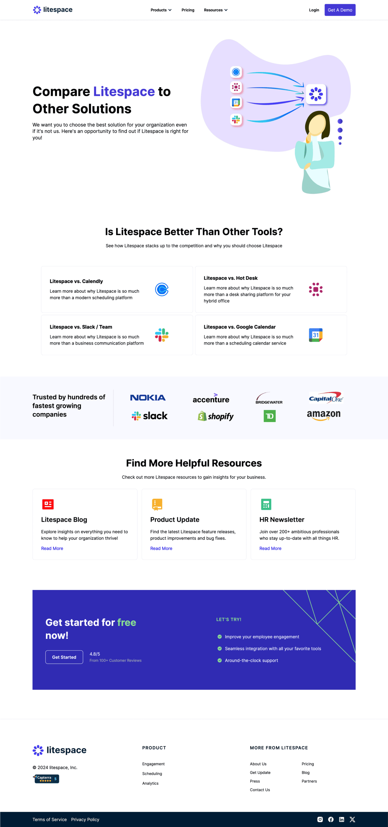
From pricing and use cases to webinars, podcasts, HR resources, and product updates, each page served a different purpose. My focus was on creating clear content hierarchies, intuitive navigation, and consistent interfaces that helped visitors explore the platform and its resources.

I carried these experiences from Figma into Webflow, using CMS collections where appropriate to make content easier to publish and maintain.

Design Approach / 01

Making product information easier to explore.

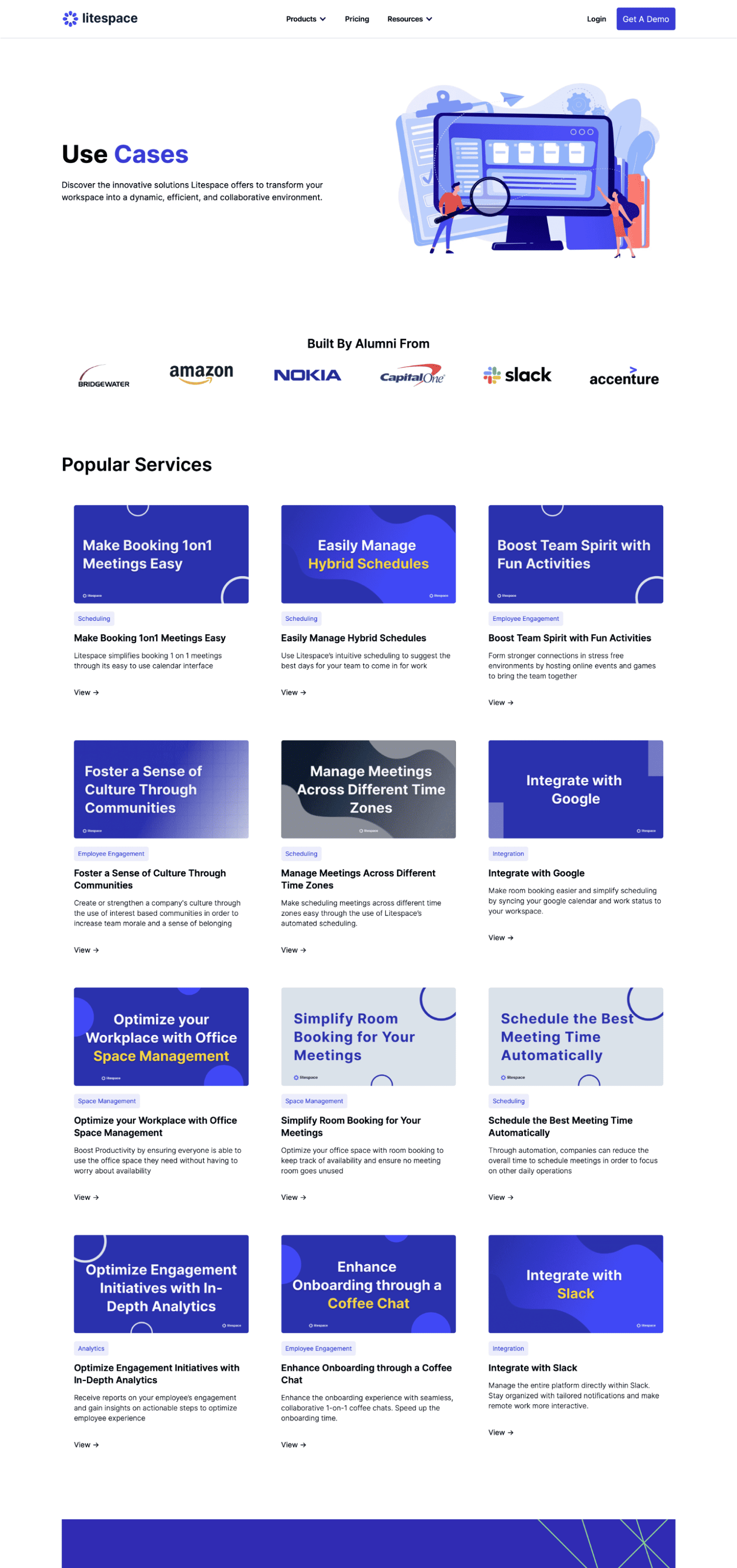
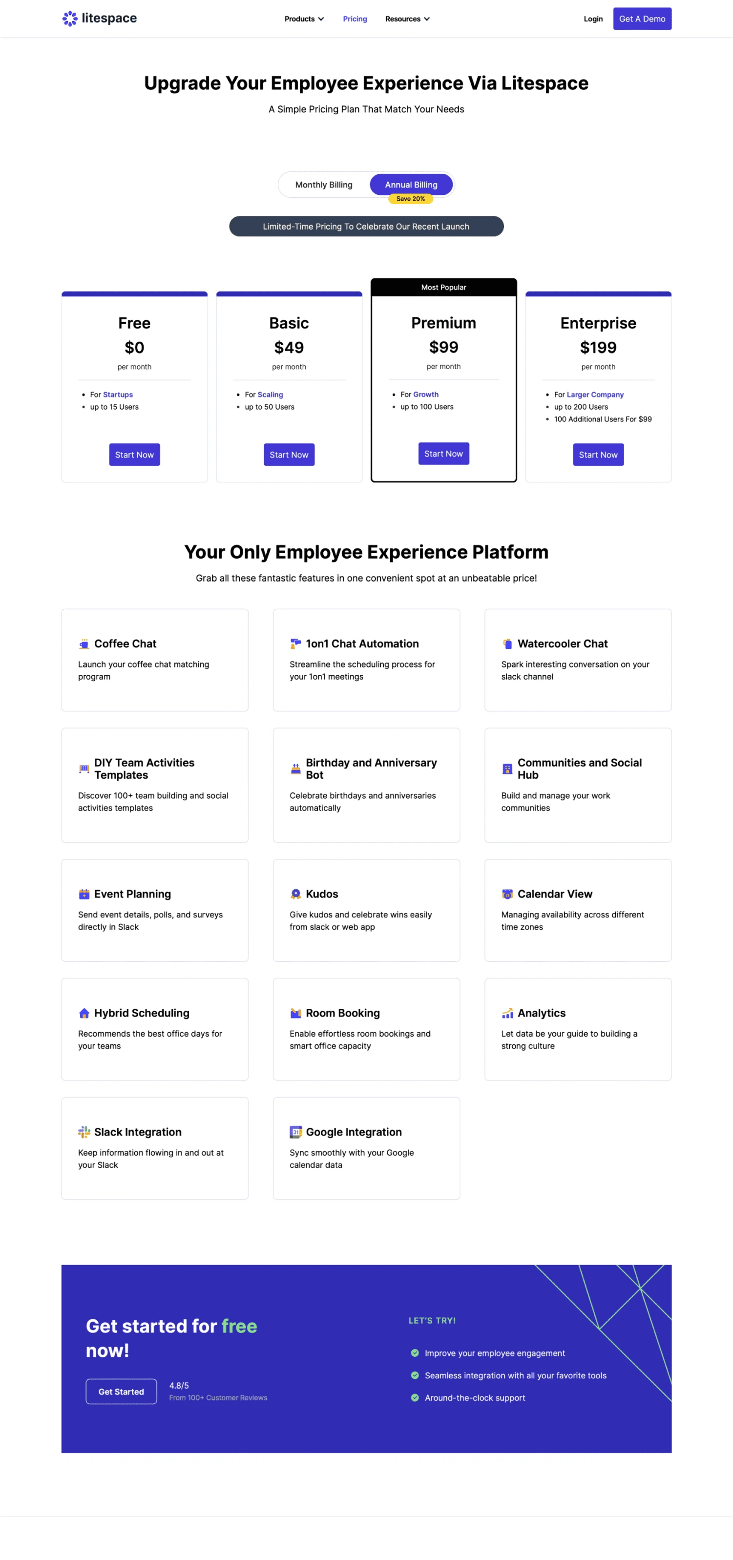
I designed Litespace's Pricing and Use Cases pages from scratch, creating clearer ways for visitors to explore the platform's capabilities and understand its value.

The pricing experience organized different plans, billing options, and included features into a structured layout that made comparison easier. The Use Cases page took a different approach, presenting practical workplace scenarios through a browsable collection of cards.

Both experiences focused on making information easier to scan, helping visitors find what was relevant to them and supporting more informed decisions about Litespace.
Design Approach / 02

Creating a more accessible resource ecosystem.

As Litespace expanded its educational content, I designed new experiences to help visitors discover and explore relevant HR resources.

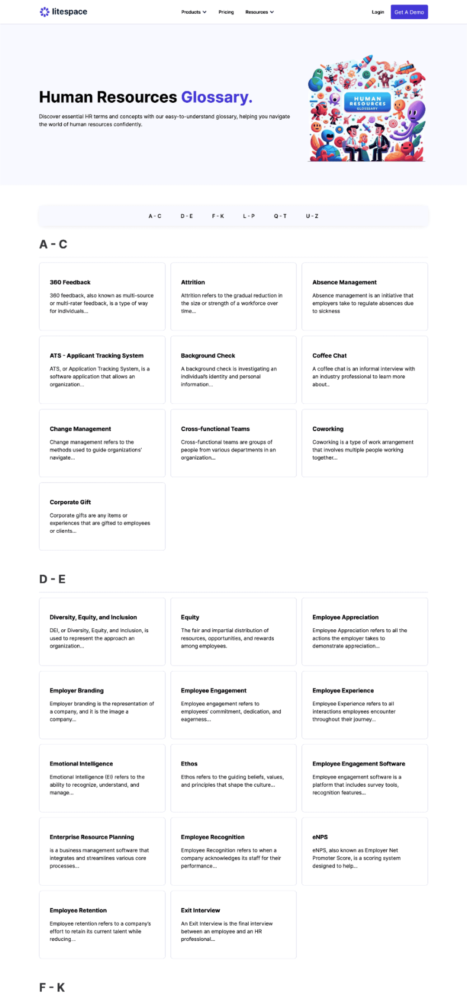
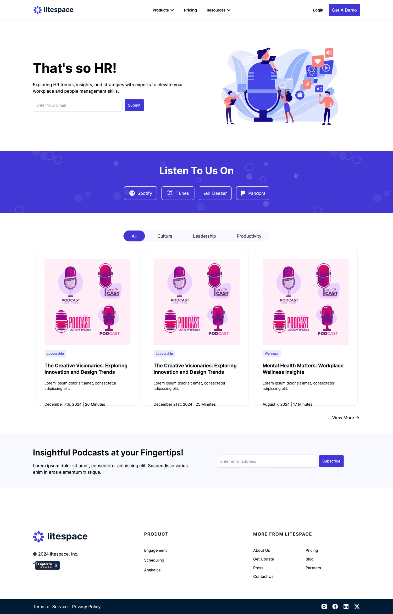
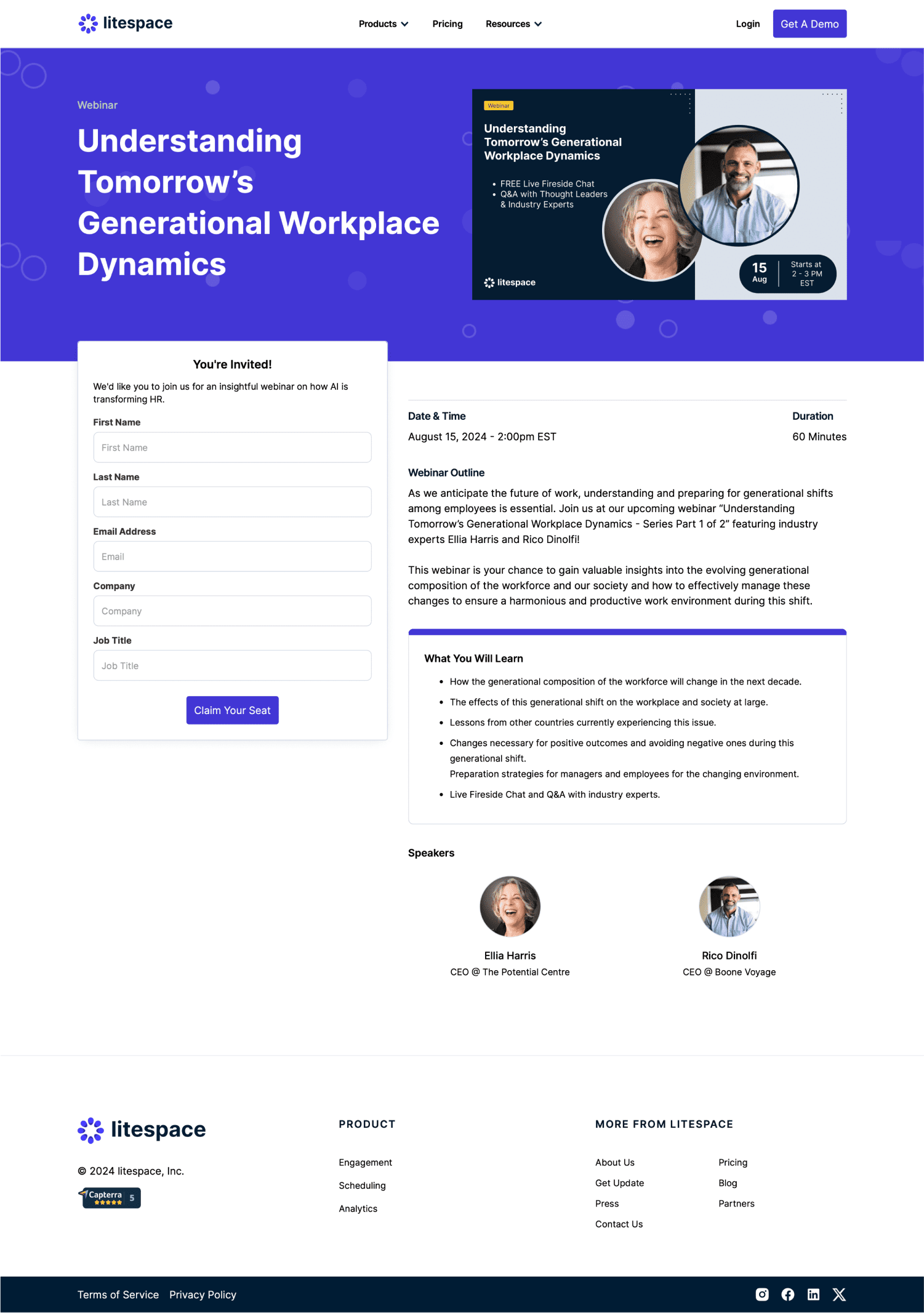
This included the HR Glossary, Podcasts, and Webinar pages, each with different content and navigation requirements. The HR Glossary organized workplace terminology into an alphabetical directory, while the Podcasts and Webinar pages provided structured layouts for browsing content and learning more about individual episodes or events.

I focused on clear information hierarchy, consistent content patterns, and intuitive navigation, while using Webflow CMS functionality where appropriate to support ongoing content updates.
Design Approach / 03

Making information easier to access and maintain.

As Litespace's website expanded, I designed content-focused experiences that helped visitors find relevant information through clear, consistent layouts.

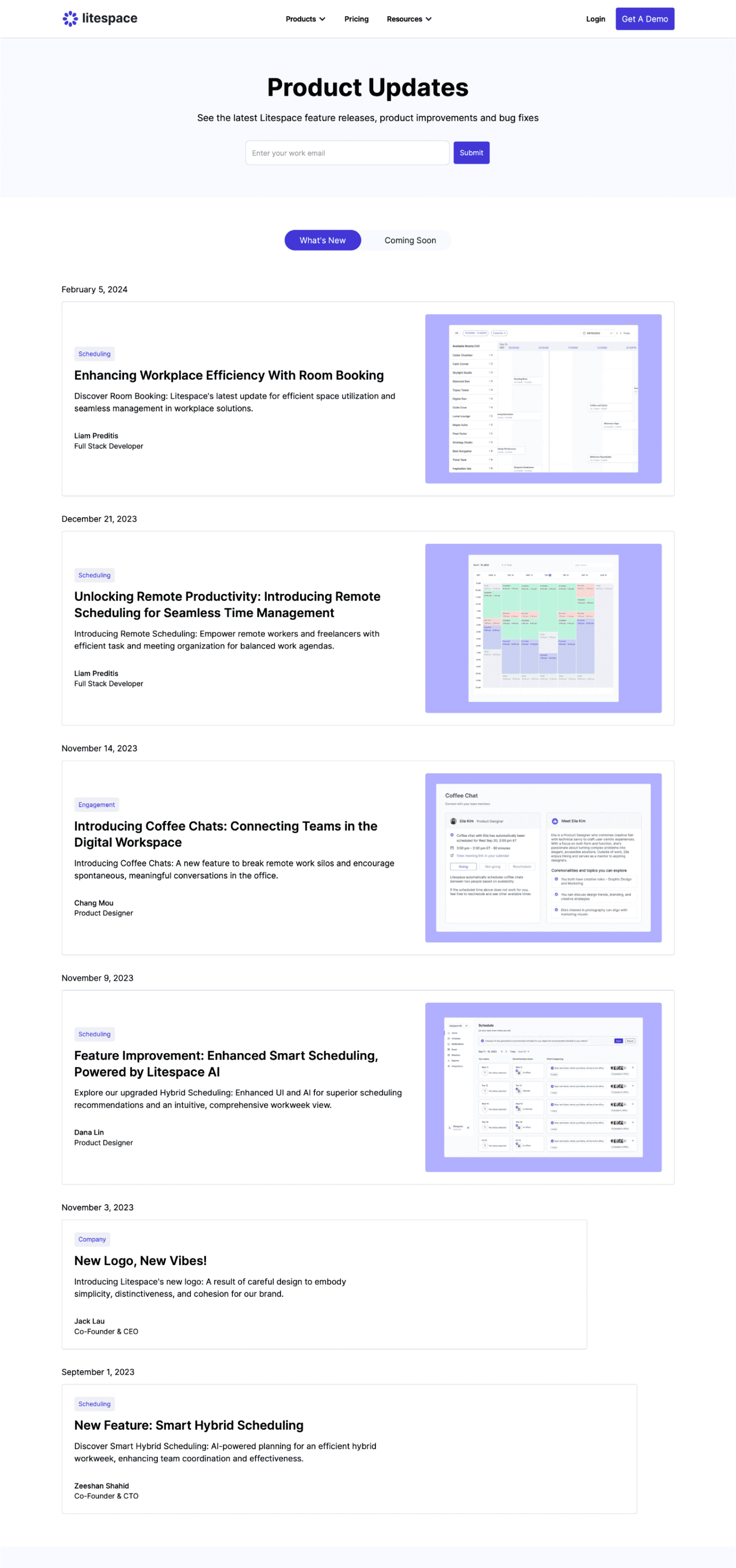
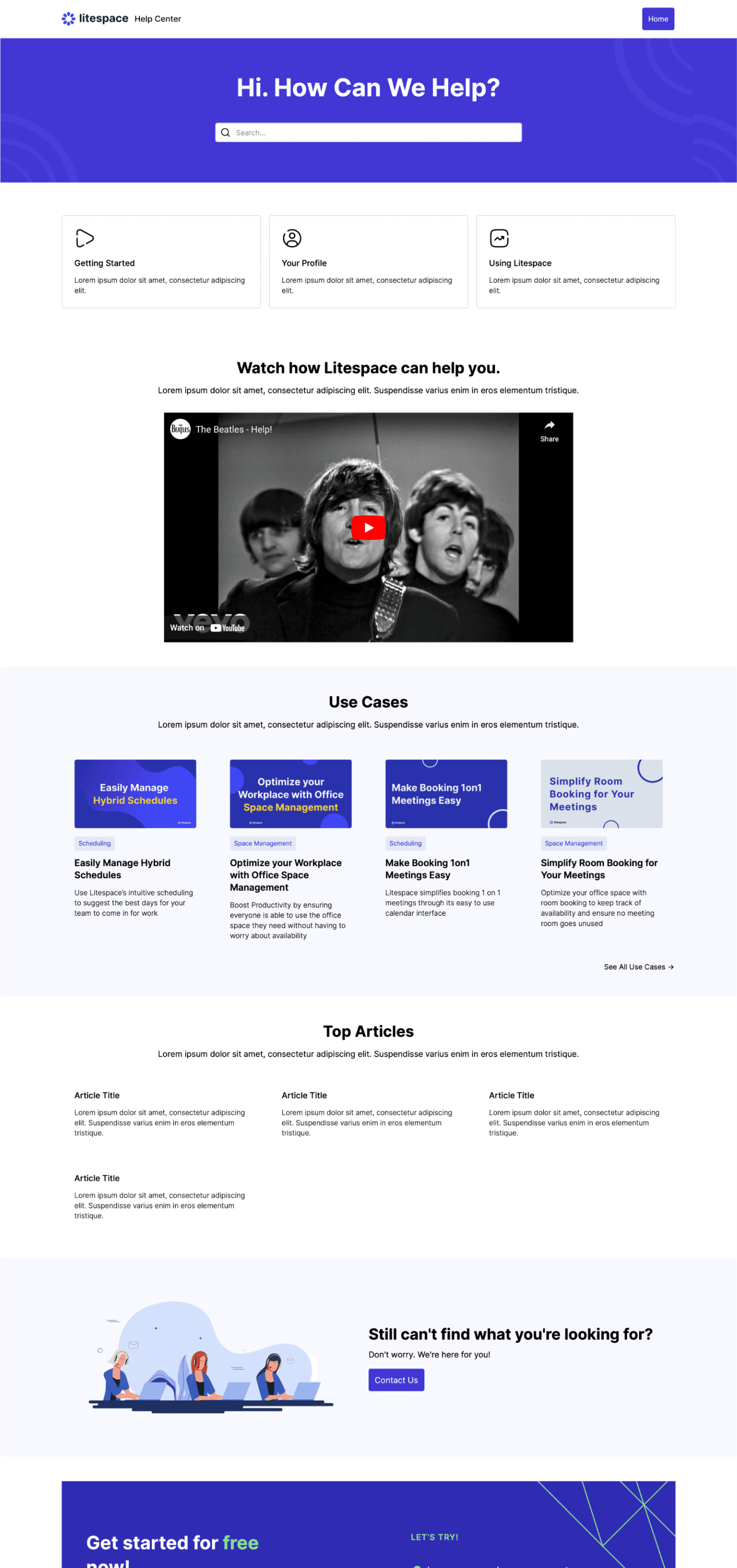
The Product Updates page provided a structured way to explore new features and announcements, while the Help Center organized support resources into an approachable, easy-to-navigate interface.

Across these experiences, I focused on information hierarchy, reusable design patterns, and implementing layouts in Webflow that could support the website's evolving content needs.
Designing beyond the interface.

Taking ownership from design to development.

As a Product Designer at Litespace, I worked across the company's public-facing website, designing new pages, improving existing experiences, and contributing to a more consistent visual language. My responsibilities covered the full design process, from understanding requirements and exploring early concepts to refining high-fidelity designs through feedback.

Unlike projects where my involvement ended at design handoff, I also implemented my work directly in Webflow. This included building responsive layouts, working with CMS collections, and translating reusable components into functional website experiences. Collaborating with stakeholders throughout the process allowed me to balance usability, business priorities, and implementation needs.

Key contributions

UX/UI Design · Website Development · Information Architecture · Design Systems · Webflow CMS · Stakeholder Collaboration

Building a stronger foundation for growth.

A more cohesive website, designed and built to evolve.

My work at Litespace helped transform an outdated website into a more cohesive and content-rich experience. I designed and implemented new pages, improved existing layouts, and introduced consistent patterns across product information, educational resources, and supporting content.

These improvements supported the company's broader efforts to attract visitors and encourage deeper exploration of its website. Traffic increased during this period, although the impact of individual design changes wasn't measured separately.

01 / Expanded Website Experience

Designed and launched new pages for pricing, use cases, webinars, podcasts, HR resources, product updates, and support—giving visitors more ways to explore Litespace's offering.

02 / Consistency & Reusability

Contributed reusable components and layouts that created greater visual consistency across the website and provided a foundation for future pages.

03 / Design-to-Launch Ownership

Took website experiences from early design concepts through feedback and iteration to implementation in Webflow, including CMS-driven content where appropriate.

Designing with implementation in mind.

Working at Litespace gave me the opportunity to take ownership of website experiences beyond the design stage. From exploring early concepts in Figma to implementing finished pages in Webflow, I learned to think not only about how an interface looked and functioned, but also how it would be built, maintained, and expanded.

The experience strengthened my ability to balance user needs, business objectives, and technical constraints. It also reinforced the value of reusable design patterns and close collaboration, especially in a growing company where priorities and requirements were constantly evolving.
Litespace / Blog Experience

Making HR content easier to discover.

Redesigning Litespace's blog experience to help visitors find relevant articles, explore more content, and navigate a growing library of HR resources.

Role
Product Designer
Project Type
Blog Redesign & CMS
Contribution
UX/UI Design · Information Architecture · Webflow CMS

The project

Rethinking how visitors discover and explore HR content.

As Litespace expanded its library of HR-focused articles and resources, its existing blog experience needed to evolve. The older layout offered limited ways to explore content, making it harder for visitors to discover relevant articles or navigate beyond the most recent posts.

I worked on redesigning the blog experience, from the main directory and category navigation to individual article layouts. The goal was to create a clearer, more intuitive content ecosystem that encouraged exploration while remaining easy to manage as the library grew.

Alongside the UX/UI design, I implemented the new experience in Webflow using CMS collections, reusable templates, and content-filtering functionality.

Content was growing. Discovery wasn't.

A growing library of HR content needed a better way to be explored.

Litespace's blog was an important channel for attracting visitors and sharing HR-related knowledge. However, as more articles were published, the existing experience made it difficult to discover content beyond the most recent posts.

The older layout lacked clear content organization and efficient browsing options, limiting how easily visitors could find articles relevant to their interests.

The challenge was to improve content discovery and navigation while creating a more scalable publishing experience that supported Litespace's broader traffic and engagement goals.

01

Limited content discoverability

Visitors had few ways to browse the growing article library or find content beyond the most recently published posts.

02

Unstructured browsing experience

Without clear category navigation and pagination, exploring older or topic-specific articles required more effort.

03

A need for scalable content publishing

As Litespace continued producing HR resources, the blog needed consistent layouts and CMS-driven templates that could accommodate new articles without requiring individual page builds.

From research to redesign.

Rethinking the blog experience through iteration.

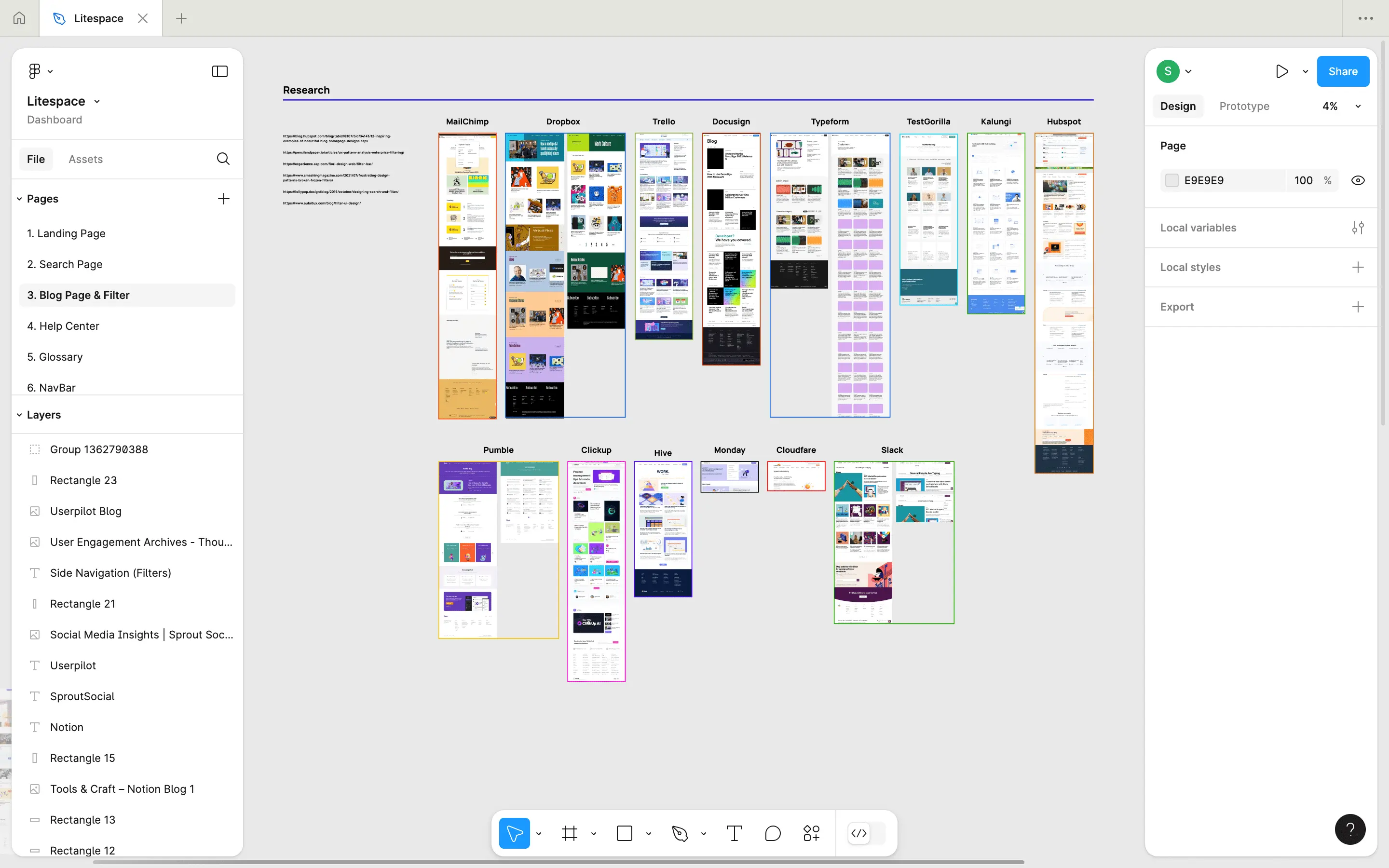
I began by reviewing Litespace's existing blog experience and exploring ways to make its growing library of HR content easier to navigate.

Using Figma, I moved from early research and low-fidelity wireframes into high-fidelity explorations, refining the layout, content organization, and visual hierarchy through multiple iterations.

The final direction focused on making articles easier to discover and browse, while creating a consistent experience that could be implemented and maintained through Webflow CMS.

01

Reviewing the existing experience

I examined the original blog layout and explored opportunities to improve article visibility, navigation, and content organization.

02

Exploring new layouts

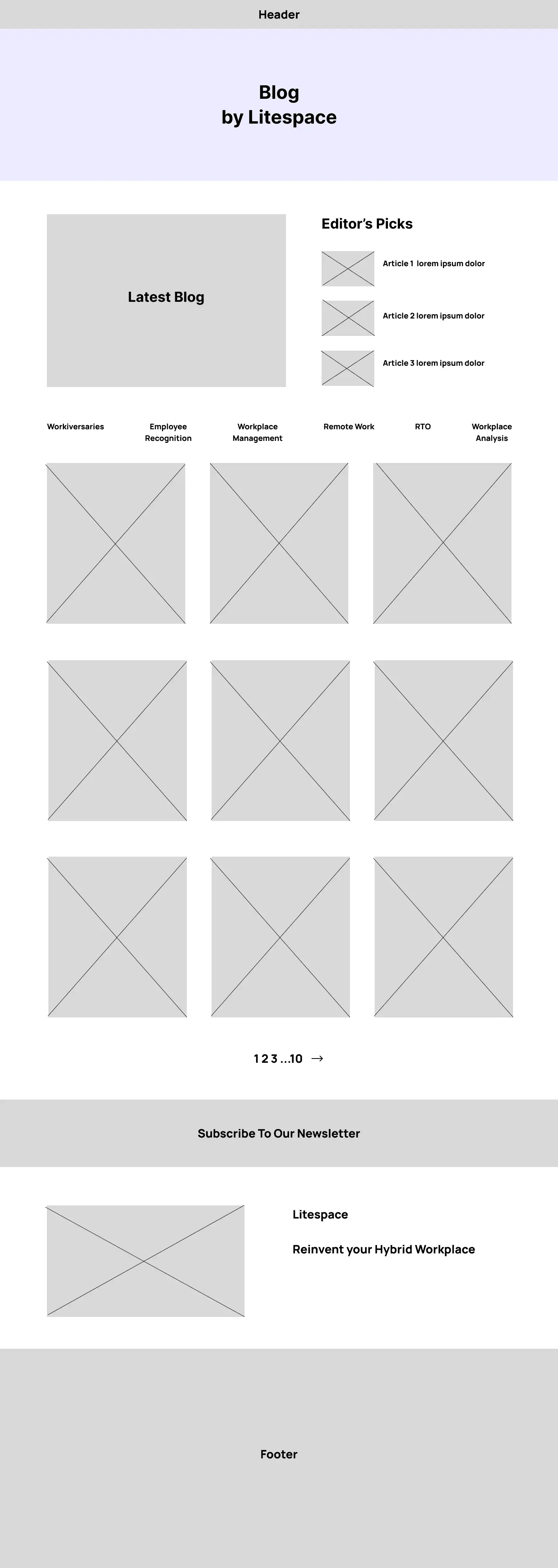
I created low-fidelity wireframes to test how category navigation, article cards, and content hierarchy could work together in a more structured browsing experience.

03

Iterating on the visual experience

I developed and refined high-fidelity designs, adjusting the layout, spacing, and content presentation through multiple iterations before settling on the final direction.

04

Implementing the redesign

I built the approved experience in Webflow, using CMS-driven article templates and functionality for filtering and navigating the content library.

Behind The Scenes

From early explorations to a refined blog experience.

The redesign evolved through several rounds of exploration and refinement. I started by studying the existing blog experience, then explored new structures in low-fidelity wireframes before developing and iterating on high-fidelity layouts.

The progression below shows how the design evolved, from early research to the final experience that was implemented in Webflow.

Making content easier to explore.

A more intuitive and scalable blog experience.

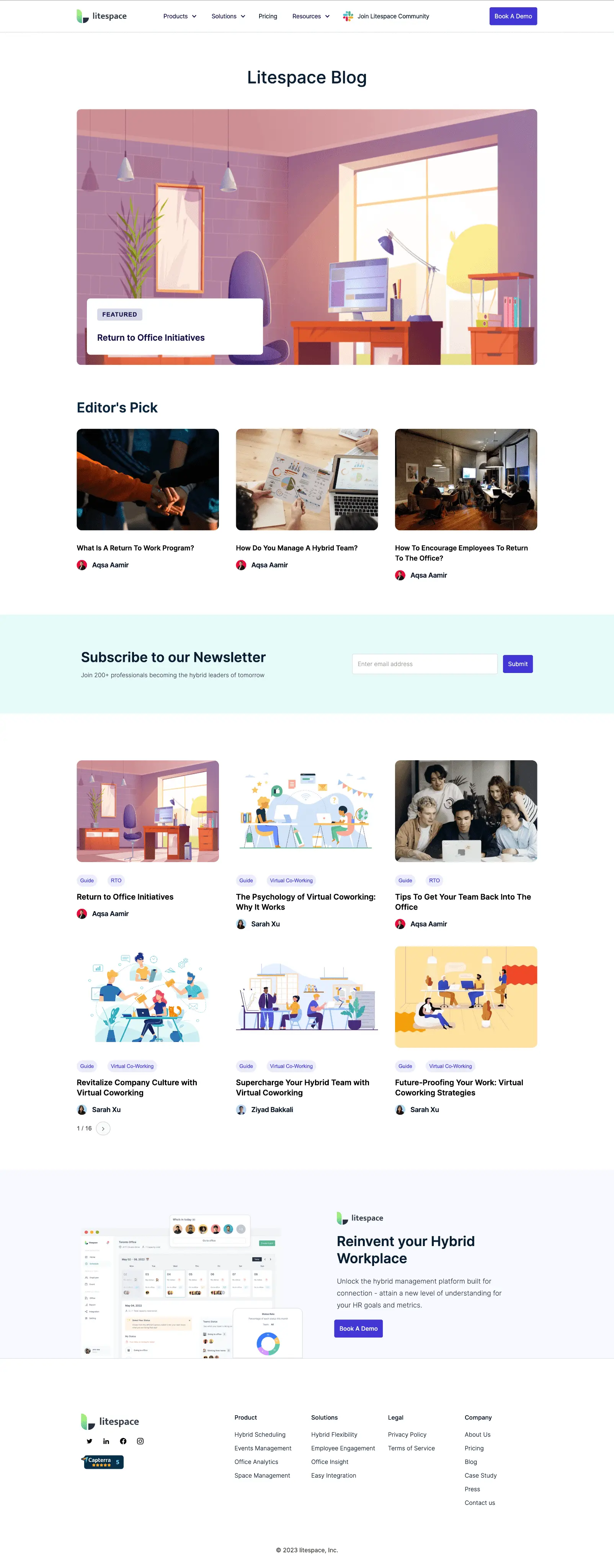
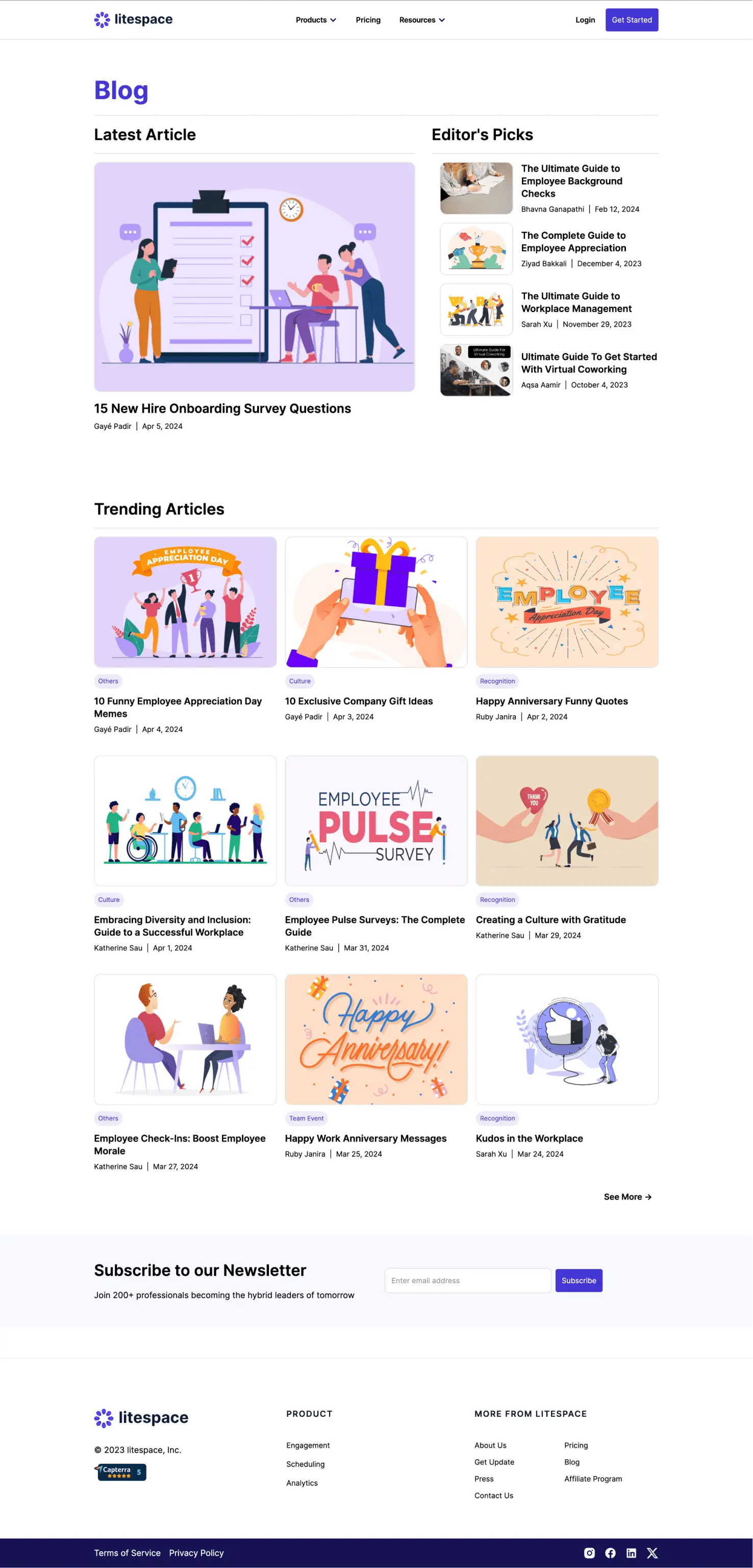
The redesigned blog focused on helping visitors discover relevant content, navigate between topics, and engage with Litespace's growing library of HR resources.

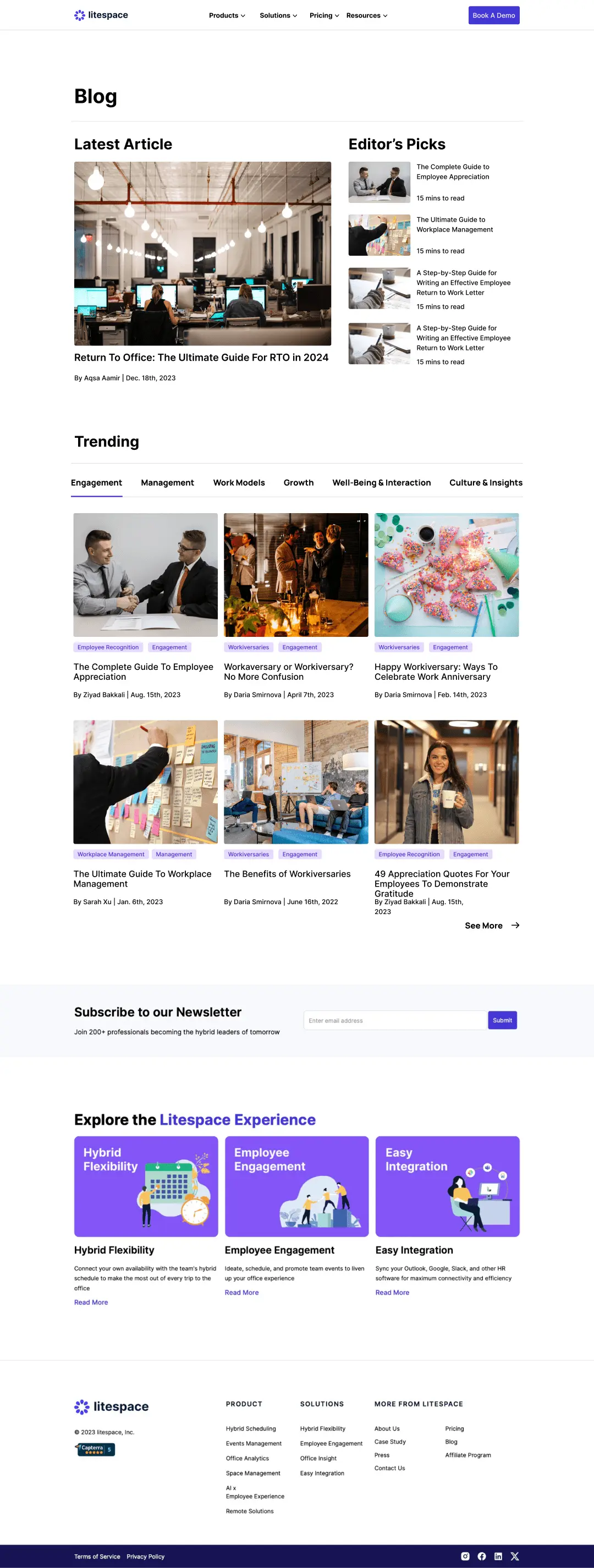
I reworked the overall page structure, introducing clearer article groupings, improved category navigation, and a more consistent visual hierarchy. These changes were designed to make browsing feel more intuitive while giving individual articles greater visibility.

Alongside the interface redesign, I implemented the experience in Webflow using CMS collections and reusable templates, allowing content to be published and maintained through a structured system.

Design Approach / 01

Rethinking the blog browsing experience.

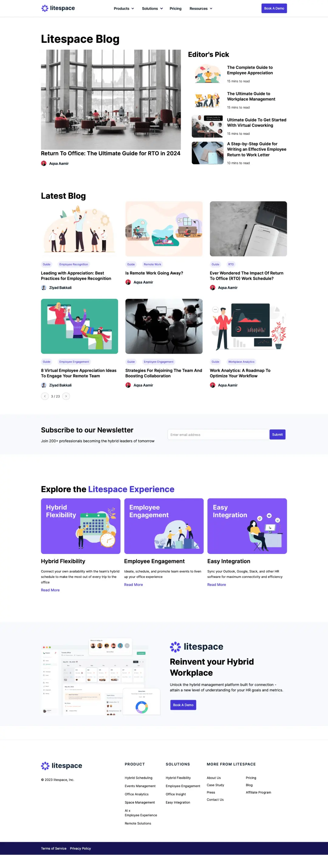
The original blog relied on a relatively simple layout that offered limited ways for visitors to explore Litespace's growing collection of HR articles. As more content was published, the experience needed a clearer structure that made individual articles easier to find and browse.

I redesigned the blog landing page with a stronger visual hierarchy, more organized article groupings, and clearer navigation. The updated experience gave greater prominence to content while introducing a more structured approach to browsing different topics.

Rather than focusing solely on a visual refresh, the redesign aimed to make the blog easier to explore and better equipped to accommodate new content over time.

Design Approach / 02

Improving content discovery and article experiences.

Beyond the main blog redesign, I focused on making it easier for visitors to navigate Litespace's growing collection of HR articles and explore content relevant to their interests.

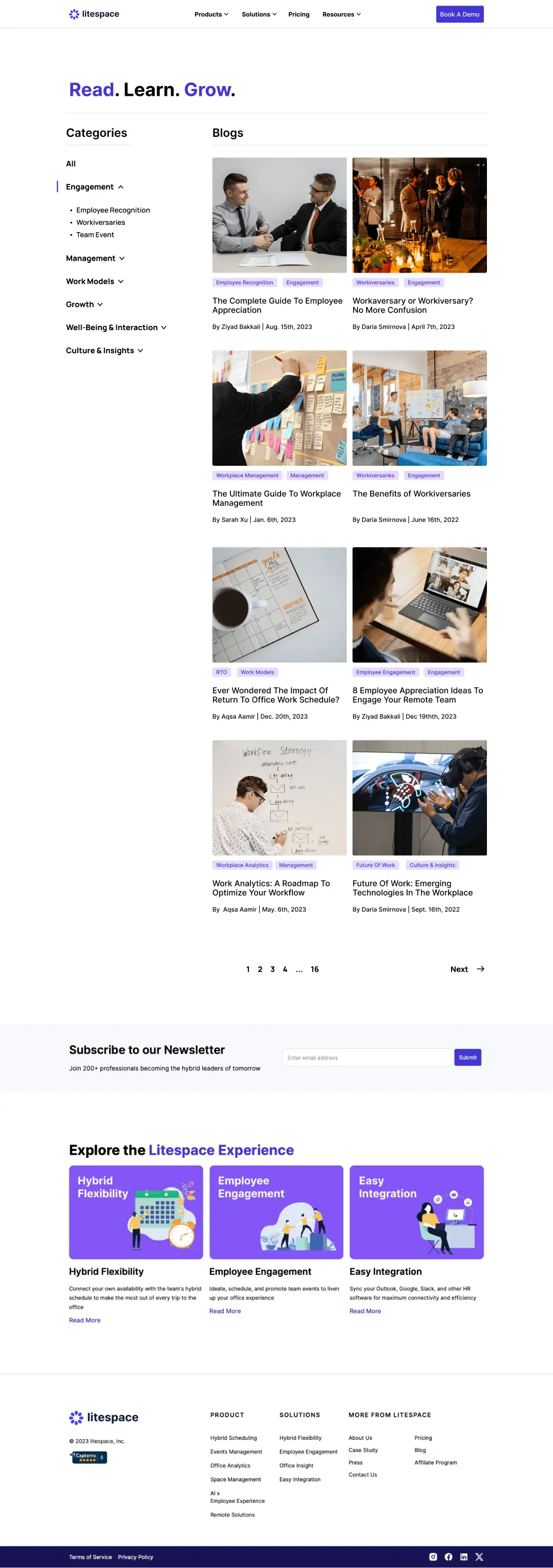
I designed a dedicated browsing experience where visitors could explore articles through a left-hand category navigation and move between results using pagination. This provided a more structured way to discover content beyond the articles featured on the main blog page.

I also designed individual article layouts using reusable content patterns and implemented them through Webflow CMS. Together, these experiences connected content discovery with a consistent reading experience, while supporting the ongoing publication of new articles.

Taking ownership of the experience.

From identifying UX challenges to building the final solution.

As a Product Designer at Litespace, I was responsible for redesigning the blog experience, from evaluating the existing layouts and exploring new content structures to refining the final interface in Figma.

My work included improving the blog landing page, designing category-based navigation and pagination, and creating reusable layouts for individual articles. I also implemented the experience in Webflow, using CMS functionality to support consistent article publishing and maintenance.

Key contributions

UX/UI Design · Information Architecture · Wireframing & Prototyping · Visual Design · Webflow Development · CMS Implementation

A better way to discover and explore content.

A more structured blog experience, built for growth.

The redesigned blog introduced a clearer and more consistent experience for discovering, navigating, and reading Litespace's growing library of HR content.

By improving the landing page, introducing dedicated category-based browsing, and implementing reusable article templates in Webflow, I helped establish a more organized experience for visitors and a structured foundation for ongoing content publishing.

While these improvements supported Litespace's broader website traffic and engagement goals, the impact of individual design changes wasn't measured independently.

01 / IMPROVED CONTENT DISCOVERY

Introduced a dedicated browsing experience with left-hand category navigation and pagination, giving visitors clearer ways to explore articles beyond the main blog page.

02 / A MORE CONSISTENT READING EXPERIENCE

Redesigned the blog landing page and individual article layouts with clearer visual hierarchy, structured content presentation, and reusable design patterns.

03 / SCALABLE CONTENT PUBLISHING

Implemented CMS-driven article templates in Webflow, creating a consistent structure for publishing and maintaining new blog content without designing each article page individually.

Designing for discovery, not just presentation.

Redesigning Litespace's blog reinforced the importance of looking beyond individual page layouts to understand how people discover and navigate content. What began as an opportunity to modernize the interface became a broader exercise in improving information architecture, content hierarchy, and the overall browsing experience.

Taking the project from early wireframes and design iterations through to Webflow implementation also strengthened my understanding of how design decisions translate into functional, maintainable experiences. It highlighted the value of creating flexible content structures that can evolve as a platform grows.

Litespace / Blog Experience

Making HR content easier to discover.

Redesigning Litespace's blog experience to help visitors find relevant articles, explore more content, and navigate a growing library of HR resources.

Role
Product Designer
Project Type
Blog Redesign & CMS
Contribution
UX/UI Design · Information Architecture · Webflow CMS

The project

Rethinking how visitors discover and explore HR content.

As Litespace expanded its library of HR-focused articles and resources, its existing blog experience needed to evolve. The older layout offered limited ways to explore content, making it harder for visitors to discover relevant articles or navigate beyond the most recent posts.

I worked on redesigning the blog experience, from the main directory and category navigation to individual article layouts. The goal was to create a clearer, more intuitive content ecosystem that encouraged exploration while remaining easy to manage as the library grew.

Alongside the UX/UI design, I implemented the new experience in Webflow using CMS collections, reusable templates, and content-filtering functionality.

Content was growing. Discovery wasn't.

A growing library of HR content needed a better way to be explored.

Litespace's blog was an important channel for attracting visitors and sharing HR-related knowledge. However, as more articles were published, the existing experience made it difficult to discover content beyond the most recent posts.

The older layout lacked clear content organization and efficient browsing options, limiting how easily visitors could find articles relevant to their interests.

The challenge was to improve content discovery and navigation while creating a more scalable publishing experience that supported Litespace's broader traffic and engagement goals.

01

Limited content discoverability

Visitors had few ways to browse the growing article library or find content beyond the most recently published posts.

02

Unstructured browsing experience

Without clear category navigation and pagination, exploring older or topic-specific articles required more effort.

03

A need for scalable content publishing

As Litespace continued producing HR resources, the blog needed consistent layouts and CMS-driven templates that could accommodate new articles without requiring individual page builds.

From research to redesign.

Rethinking the blog experience through iteration.

I began by reviewing Litespace's existing blog experience and exploring ways to make its growing library of HR content easier to navigate.

Using Figma, I moved from early research and low-fidelity wireframes into high-fidelity explorations, refining the layout, content organization, and visual hierarchy through multiple iterations.

The final direction focused on making articles easier to discover and browse, while creating a consistent experience that could be implemented and maintained through Webflow CMS.

01

Reviewing the existing experience

I examined the original blog layout and explored opportunities to improve article visibility, navigation, and content organization.

02

Exploring new layouts

I created low-fidelity wireframes to test how category navigation, article cards, and content hierarchy could work together in a more structured browsing experience.

03

Iterating on the visual experience

I developed and refined high-fidelity designs, adjusting the layout, spacing, and content presentation through multiple iterations before settling on the final direction.

04

Implementing the redesign

I built the approved experience in Webflow, using CMS-driven article templates and functionality for filtering and navigating the content library.

Behind The Scenes

From early explorations to a refined blog experience.

The redesign evolved through several rounds of exploration and refinement. I started by studying the existing blog experience, then explored new structures in low-fidelity wireframes before developing and iterating on high-fidelity layouts.

The progression below shows how the design evolved, from early research to the final experience that was implemented in Webflow.

Making content easier to explore.

A more intuitive and scalable blog experience.

The redesigned blog focused on helping visitors discover relevant content, navigate between topics, and engage with Litespace's growing library of HR resources.

I reworked the overall page structure, introducing clearer article groupings, improved category navigation, and a more consistent visual hierarchy. These changes were designed to make browsing feel more intuitive while giving individual articles greater visibility.

Alongside the interface redesign, I implemented the experience in Webflow using CMS collections and reusable templates, allowing content to be published and maintained through a structured system.

Design Approach / 01

Rethinking the blog browsing experience.

The original blog relied on a relatively simple layout that offered limited ways for visitors to explore Litespace's growing collection of HR articles. As more content was published, the experience needed a clearer structure that made individual articles easier to find and browse.

I redesigned the blog landing page with a stronger visual hierarchy, more organized article groupings, and clearer navigation. The updated experience gave greater prominence to content while introducing a more structured approach to browsing different topics.

Rather than focusing solely on a visual refresh, the redesign aimed to make the blog easier to explore and better equipped to accommodate new content over time.

Design Approach / 02

Improving content discovery and article experiences.

Beyond the main blog redesign, I focused on making it easier for visitors to navigate Litespace's growing collection of HR articles and explore content relevant to their interests.

I designed a dedicated browsing experience where visitors could explore articles through a left-hand category navigation and move between results using pagination. This provided a more structured way to discover content beyond the articles featured on the main blog page.

I also designed individual article layouts using reusable content patterns and implemented them through Webflow CMS. Together, these experiences connected content discovery with a consistent reading experience, while supporting the ongoing publication of new articles.

Taking ownership of the experience.

From identifying UX challenges to building the final solution.

As a Product Designer at Litespace, I was responsible for redesigning the blog experience, from evaluating the existing layouts and exploring new content structures to refining the final interface in Figma.

My work included improving the blog landing page, designing category-based navigation and pagination, and creating reusable layouts for individual articles. I also implemented the experience in Webflow, using CMS functionality to support consistent article publishing and maintenance.

Key contributions

UX/UI Design · Information Architecture · Wireframing & Prototyping · Visual Design · Webflow Development · CMS Implementation

A better way to discover and explore content.

A more structured blog experience, built for growth.

The redesigned blog introduced a clearer and more consistent experience for discovering, navigating, and reading Litespace's growing library of HR content.

By improving the landing page, introducing dedicated category-based browsing, and implementing reusable article templates in Webflow, I helped establish a more organized experience for visitors and a structured foundation for ongoing content publishing.

While these improvements supported Litespace's broader website traffic and engagement goals, the impact of individual design changes wasn't measured independently.

01 / IMPROVED CONTENT DISCOVERY

Introduced a dedicated browsing experience with left-hand category navigation and pagination, giving visitors clearer ways to explore articles beyond the main blog page.

02 / A MORE CONSISTENT READING EXPERIENCE

Redesigned the blog landing page and individual article layouts with clearer visual hierarchy, structured content presentation, and reusable design patterns.

03 / SCALABLE CONTENT PUBLISHING

Implemented CMS-driven article templates in Webflow, creating a consistent structure for publishing and maintaining new blog content without designing each article page individually.

Designing for discovery, not just presentation.

Redesigning Litespace's blog reinforced the importance of looking beyond individual page layouts to understand how people discover and navigate content. What began as an opportunity to modernize the interface became a broader exercise in improving information architecture, content hierarchy, and the overall browsing experience.

Taking the project from early wireframes and design iterations through to Webflow implementation also strengthened my understanding of how design decisions translate into functional, maintainable experiences. It highlighted the value of creating flexible content structures that can evolve as a platform grows.